
OK, so as mobile use becomes more and more popular and fewer people make purchases online using a desktop PC, we need to ensure that we make the Woocommerce checkout process as efficient
and quick as possible. So I came up with a few very simple code snippets and some jQuery and CSS to make it all pretty and usable. So what does it do?
When I’m using a mobile device I hate scrolling more than I hate clicking or tapping. You never know how long a page might be, so I often tend to tap out of there just to get away from the page. On a checkout page this could be a disaster. So to get around that I added a few anchor points to the checkout page so users can scroll ahead with a simple tap. Note. This will only work on a single page checkout form.
The process comprises 3 parts, although it will work with just the php snippet.
Step 1. Add the PHP snippet
Paste the following into your functions.php file of your child theme, a site specific plugin or a plugin such as My Custom Functions
/*

 * Add quick scroll buttons to checkout form anchor points

 * Author: John Cook

 * Tutorial: https://wcsuccessacademy.com/?p=549

*/

/*

 *This section adds two buttons below the billing section

 * The first goes to the shipping section

 * The second goes to the payment section

*/

add_action('woocommerce_after_checkout_billing_form', 'go_to_pay');

function go_to_pay() {

    echo 'Go To Shipping Methods'; /*you can customise this text*/

    echo '';

	echo 'Use Standard Shipping and Skip To Payment Method'; /*you can customise this text*/

}

/*

 * This section ads a third button below the shipping field to go to the payment section

*/

add_action('woocommerce_review_order_before_payment', 'go_pay');

function go_pay(){

    echo 'Select Payment Method'; /*you can customise this text*/

}
Step 2. Add jQuery
By adding jQuery it will give a smooth scroll to each form section. To make this as easy as possible for novice users I suggest installing a code plugin such as Custom CSS and JS. If you decide not to use a plugin make sure to wrap the code in <script></script> tags
/*

 * Custom jQery to add smooth scroll to the checkout page anchor points

 * Author: John Cook

 * Tutorial: https://wcsuccessacademy.com/?p=549

*/

jQuery(document).ready(function(){
jQuery("a.go-pay").on('click', function(event) {
if (this.hash !== "") {
event.preventDefault();
var hash = this.hash;
jQuery('html, body').animate({
scrollTop: jQuery(hash).offset().top
}, 400, function(){
window.location.hash = hash;
});
}
});
});
Step 3. Add some styling
The following code can be added to your theme styles typically found in appearance>>customise>>custom css. You can also add it to a CSS plugin or the plugin mentioned above. You can change the colours of your buttons background and font colours to any colour you choose, as well as font-family and text decorations.
/*

 * Style the quick scroll links

 * Aucthor: John Cook

 * Tutorial:

*/

/*

 *This first piece hides the links on larger screens, but can be left in if desired

*/

@media only screen and (min-width:600px) {

a.go-pay {

    display: none;

}

}

/*

 * Now we set it to display and style the buttons for smaller screens

*/

@media only screen and (max-width:600px){

a.go-pay {

    color:#fff;

    display:block;

    text-align:center;

    margin:auto;

    background-color:#ff5400;

    padding:8px 10px;

}
All done
You’ll notice that I made the link classes all the same. I did this for ease of styling and scrolling, but you can customise the further to make each button appear differently, just make sure to include additional jQuery for each anchor link.
What’s the result?
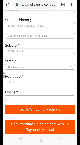
Now when someone visits the checkout page on a mobile device they will be presented with their billing details. If the billing and shipping address are the same they can now click either button to proceed to either the shipping details section or payment section, speeding up the process considerably and hopefully resulting in more sales and fewer abandoned carts. If you offer free shipping you might even be able to scroll directly to the payment section, bypassing all other details.
This is the end result
The gif makes it appear less fluid than it actually is
I have been working with WordPress and WooCommerce since 2012 and have developed a deep knowledge of the content management system. Since 2012, I have developed several plugins and designed dozens of websites utilising different frameworks, CMS’s and programming languages. I am proficient in PHP, Python, Java, C, C++, R and JavaScript with limited experience in Go, Kotlin and Swift.
Educationally, I have a Master’s degree in cyber security a Bachelor’s (Hons, First Class) in Applied Research and a Graduate Certificate in Data Science. I’m currently undertaking PhD studies investigating IoT cybersecurity. I recently graduated with First Class Honours and Masters of Information Technology, receiving the Executive Dean’s Award for studies undertaken in the 2021 and 2022 academic years. I have worked in the information technology industry for the past 11 years primarily as a software/web developer specific to design, optimisation, network management and security. My research interests are in the areas of Internet of Things (IoT), 5G and Beyond Networks, information security for wireless networks and software development.
Stay In Touch
